//Branding
What’s included in a brand identity package (and what’s worth paying for)
Ask five studios what’s in a brand identity package and you’ll get five different answers. Some send a logo and a color swatch. Others send a 90-page book nobody opens. Neither helps you run a business.
A good identity package gives you everything you need to show up the same way everywhere, without calling your designer every time you make a flyer. Here’s what that looks like.
The core: what every package should include
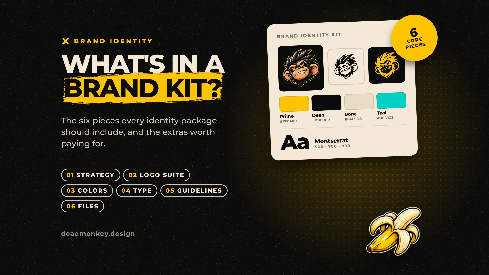
- A short strategy. One page is enough: who you’re for, what makes you different and three or four words that describe your personality. Every design decision after this gets checked against it.
- A logo suite, not a logo. You need a primary logo, a stacked or compact version, a standalone mark for small spaces like social avatars and favicons, and one-color versions for light and dark backgrounds.
- A color palette. Primary and supporting colors with HEX, RGB and CMYK values, plus a note on how much of each to use. Proportion matters as much as the colors themselves.
- Typography. One or two typefaces, how they work together for headings and body text, and a note on licensing so you know you’re allowed to use them on your website.
- Brand guidelines. A document, or better yet a web page, that shows how it all fits together, with clear dos and don’ts. Short enough that people actually read it.
- Organized files. Vector files (SVG, PDF or EPS) for print and signage, PNGs for everyday use, all named so anyone on your team can find the right one.
If a package is missing any of these six, ask why.
The extras that often earn their keep
Not every brand needs everything. These are the add-ons we see pay for themselves most often:
- A pattern or illustration system. It makes your brand recognizable even when the logo isn’t on screen. Our own brush X and grinning monkey stickers do more work than our logo some days.
- Social media templates. Ready-made layouts for posts and stories keep your feed consistent when you’re posting in a hurry.
- An animated logo. Two or three seconds of motion for video intros, presentations and your website. More on this in a few weeks.
- Tone of voice. A page on how your brand writes, with examples. It’s the most underrated part of an identity.
- Photography direction. What your images should look and feel like, so stock photos and shoots stay on brand.
- Business cards and stationery. Less essential than they used to be, but still worth it if you meet clients face to face.
Red flags to watch for
- “Branding” that’s really just a logo. A logo on its own can’t carry a brand.
- No vector files. Without them, your logo will look blurry on a sign or a van.
- Unlimited revisions. It sounds generous, but it usually means there’s no process and no strategy to steer decisions.
- Unclear ownership. You should own the final files and the rights to use them, in writing.
Questions to ask before you sign
- What’s included, file by file?
- Is strategy part of the project, or am I expected to bring it?
- How many concepts will I see, and how many rounds of changes are included?
- Who owns the final artwork?
- What happens after launch if I need a new version or a quick tweak?
The short version
A brand identity package is the toolkit that lets you look like yourself everywhere. Pay for the core six, then add the extras you’ll actually use. Not sure whether you need a whole new identity or a tune-up of the one you have? We’ll cover exactly that in two weeks.
Thinking about a new identity? Tell us what you’re working on and we’ll tell you which pieces you actually need.