//Motion
Motion design for small brands: where a little animation pays off
Motion used to mean a production budget. Now it’s a few seconds of animation that can make a small brand feel ten times more polished. The trick is knowing where it earns its keep and where it just gets in the way.
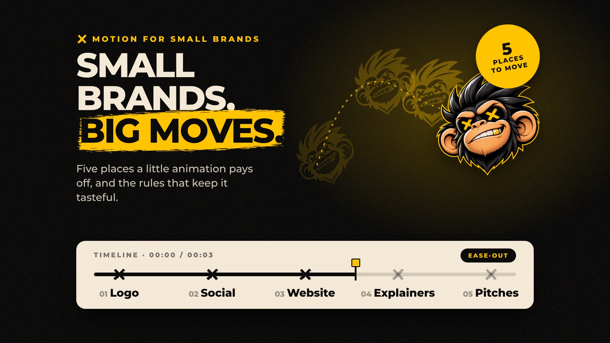
Here are the five places we’d start, and a few rules for doing it well.
1. An animated logo
This is the highest-value piece of motion most brands can buy. A two to three second animation of your logo works as a video intro, an outro, a loading screen and a social post on its own. Do it once and it pays you back every time you hit publish.
Keep it short and make the movement say something about you. A playful brand can bounce. A precise one should snap into place.
2. Social media templates
Static posts scroll past. A post where the headline slides in, or a product spins once, stops thumbs. Animated templates for your most common posts (announcements, quotes, offers) mean you get that effect every time without starting from scratch.
3. Website micro-interactions
Small movements on your website do a lot of quiet work. A button that responds when you hover, a menu that opens smoothly, sections that ease in as you scroll. They tell visitors the site is cared for, the same way good joinery tells you a cabinet is well made.
The key word is micro. Interface animations should be quick, roughly a fifth to half a second, and they should never stand between a visitor and what they came for.
4. Product and service explainers
If your offer takes a paragraph to explain, a 15 to 30 second animated explainer can do it faster. Simple shapes, your brand colors and clear captions beat expensive 3D for most small businesses. Add captions so it works with the sound off, because most people will watch it that way.
5. Presentations and pitches
A deck where charts build and key numbers count up feels more confident than a wall of static slides. You don’t need to animate everything. Pick the two or three moments in the story that matter and make them move.
The rules that keep motion tasteful
- One personality. Pick a style of movement (bouncy, smooth, snappy) and use it everywhere, like a typeface.
- Short beats long. If an animation makes someone wait, it’s too long.
- Motion has a job. It should show where something came from, what changed or what to click. Movement for its own sake gets old by the second visit.
- Respect “reduce motion”. Some people get dizzy or nauseous from animation and switch it off in their device settings. Your website should honor that.
- Mind the file size. Use lightweight formats like MP4, SVG or Lottie animations instead of heavy GIFs, so your site stays fast.
Where to start
If you only do one thing, animate your logo. It’s quick, it’s useful everywhere and it makes the rest of your brand feel more alive. If you’re putting together a new identity, it’s worth adding to the list in our brand identity package guide.
Want to see your logo move? Tell us about your brand and we’ll sketch out what it could do.