//Case study
Aqua Dental
A brand identity concept for a family dental practice: logo, palette, type, business cards, social ads and brand guidelines.


- aquadental

- aquadental

- aquadental

- aquadental

01Overview
Aqua Dental is a brand identity concept for a family dental practice: a logo, a palette and type, two brand shapes, business cards with an appointment card back, a set of social ads and brand guidelines. It is a concept, not a client project.
02Aqua Dental
The mark
The tooth is folded from two facets, like a paper model, so it reads as precise and friendly at once. Heavy AQUA carries the name; light DENTAL sits beside it.
03Aqua Dental
The palette
- Aqua#1CBAB5
- Lagoon#4EC1C0
- Mint#B3DFCF
- Deep#0B4442
- Charcoal#191818
Both aquas come straight from the logo. Mint softens the backgrounds and a deep sea green carries the words, because white text on aqua is too faint to read.
04Aqua Dental
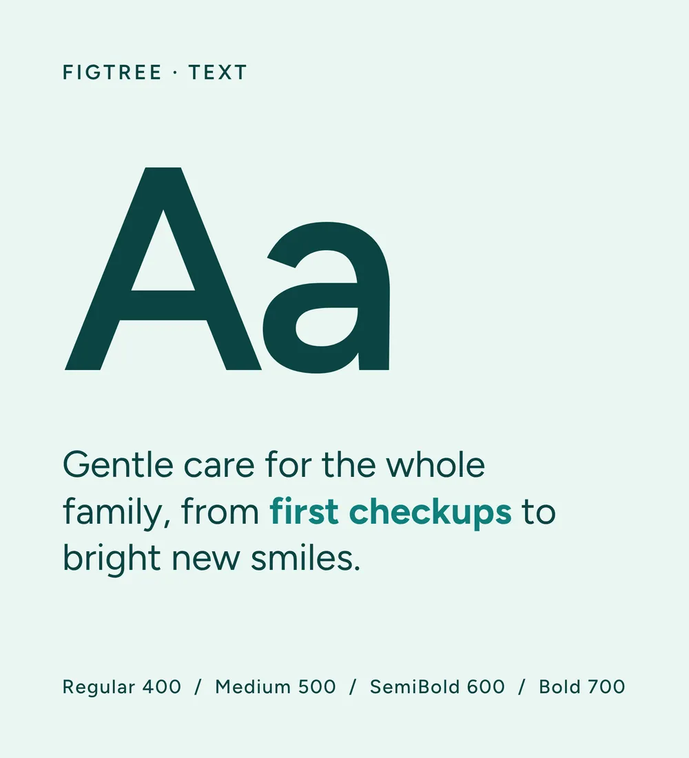
The type
Montserrat in its black italic gives the headlines their confident lean. Figtree keeps everything else calm and easy to read, from opening hours to appointment cards.

05Aqua Dental
Brand elements
Two shapes and a color field: the facet, the tooth's diagonal split; the lens, a big soft circle that frames a face or holds a headline; and flat mint behind a studio smile. Each piece uses one of them.



06Aqua Dental
Business cards
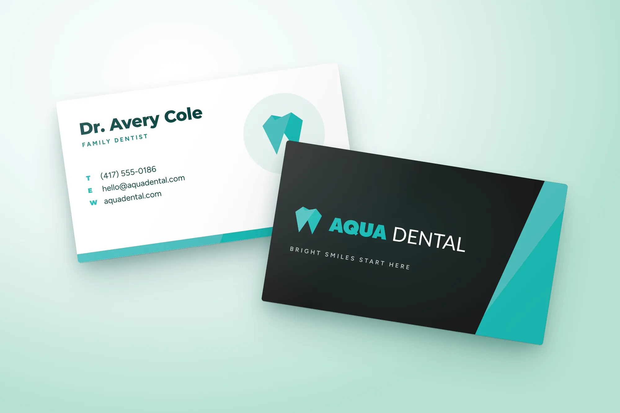
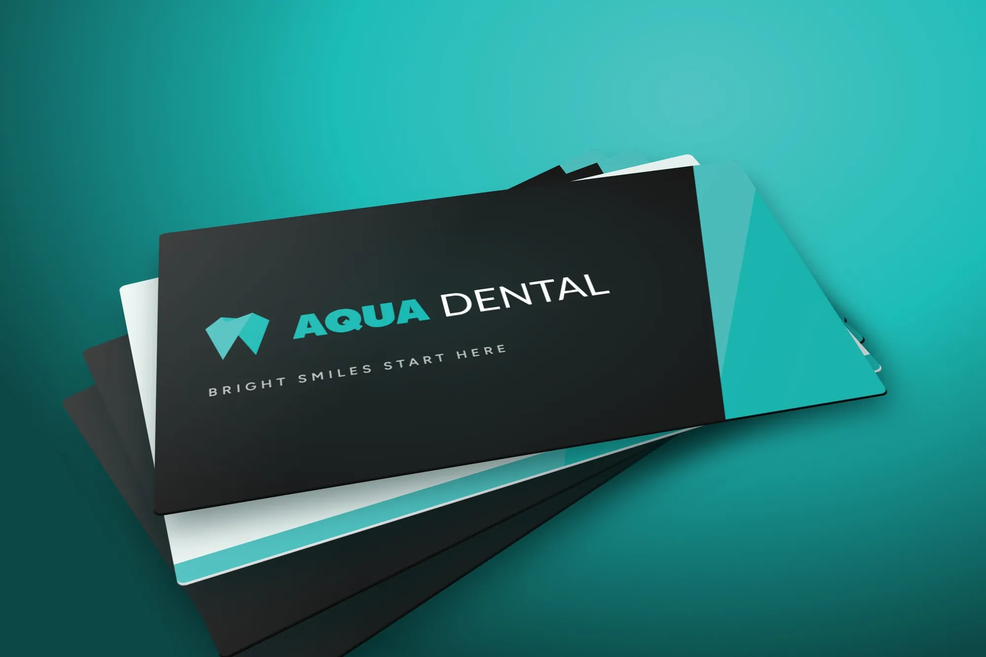
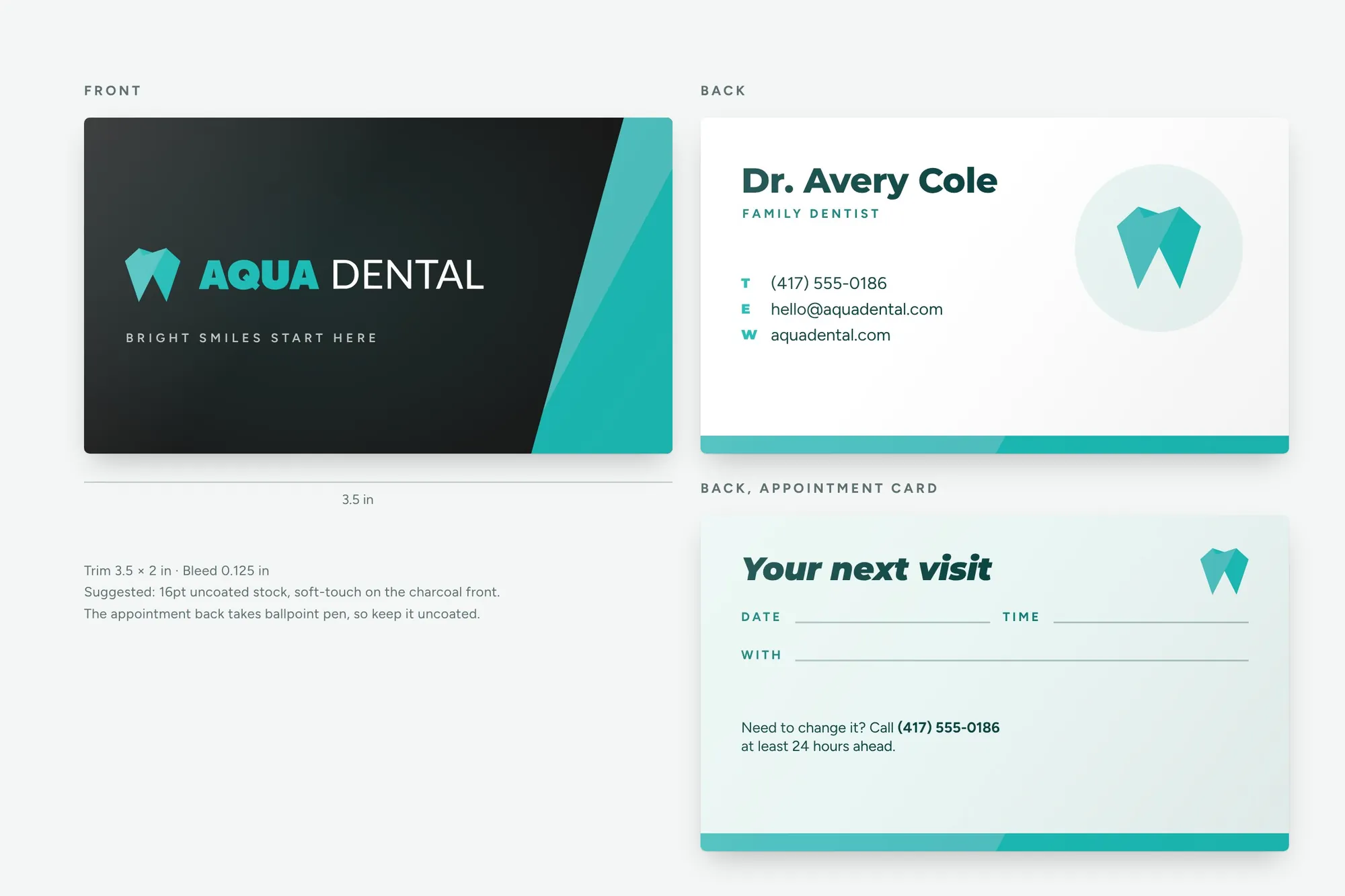
One charcoal front with the logo and a facet edge, and two backs: a contact card for the team and an appointment card with lines for the date, time and dentist. The name and contact details are sample text.
07Aqua Dental
In use
A set of social ads. Each leads with a person, carries one headline and ends on the logo, with white headlines only on deep green so they stay readable.
- aquadental

- aquadental

- aquadental

- aquadental

- aquadental