//Case study
Hydration Hut
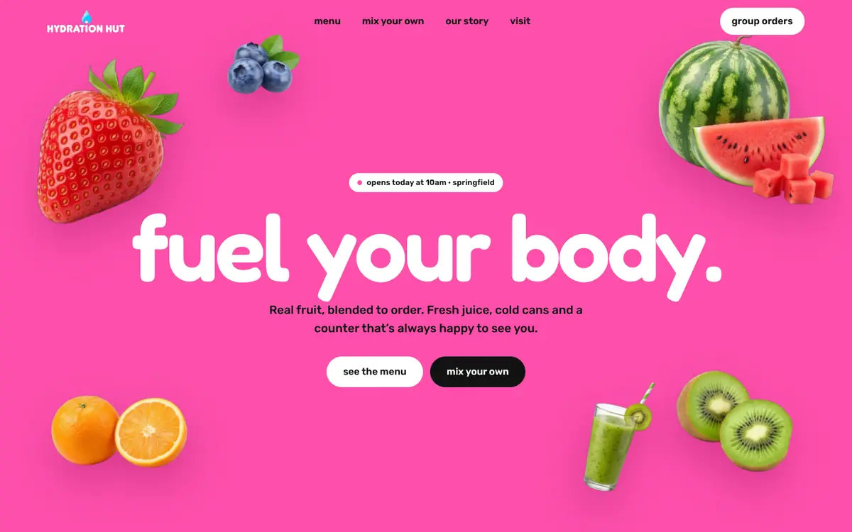
A brand identity concept for a health smoothie and juice bar: logo, palette, type, cans, business cards and ads.

- hydrationhut
- hydrationhut
- hydrationhut
- hydrationhut
01Overview
Hydration Hut is a brand identity concept for a health smoothie and juice bar: a logo, a palette and type, a line of cans, business cards and the brand in use. It is a concept, not a client project.
02Hydration Hut
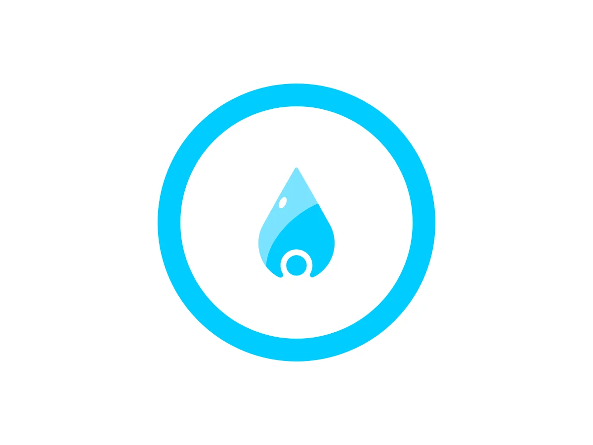
The mark
03Hydration Hut
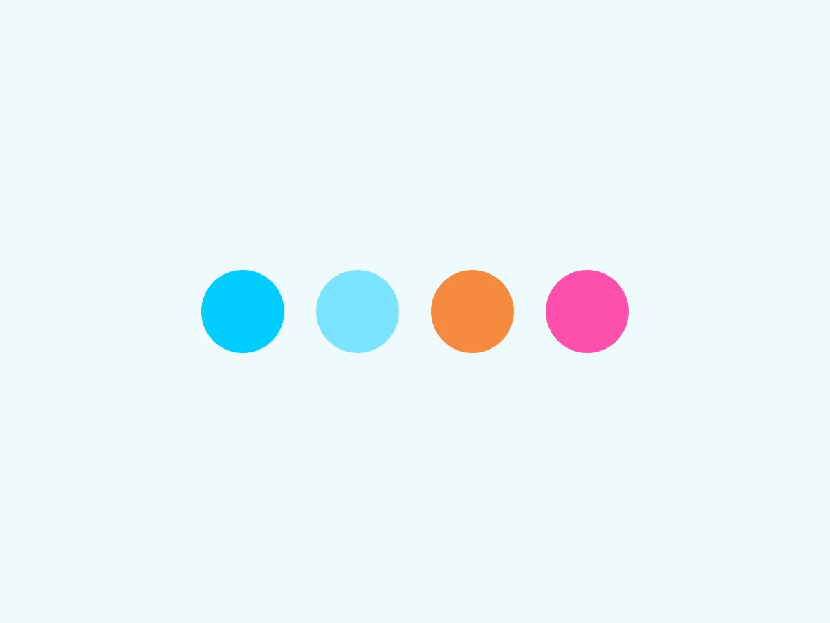
The palette
- Cyan#00CCFF
- Sky#7BE3FF
- Orange#F68A40
- Pink#FD4FAB
- White#FFFFFF
04Hydration Hut
The type
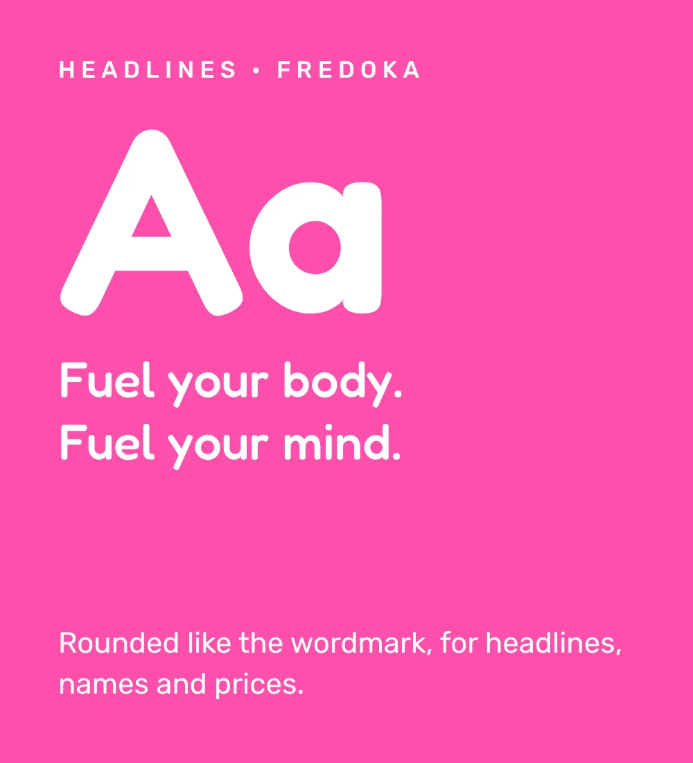
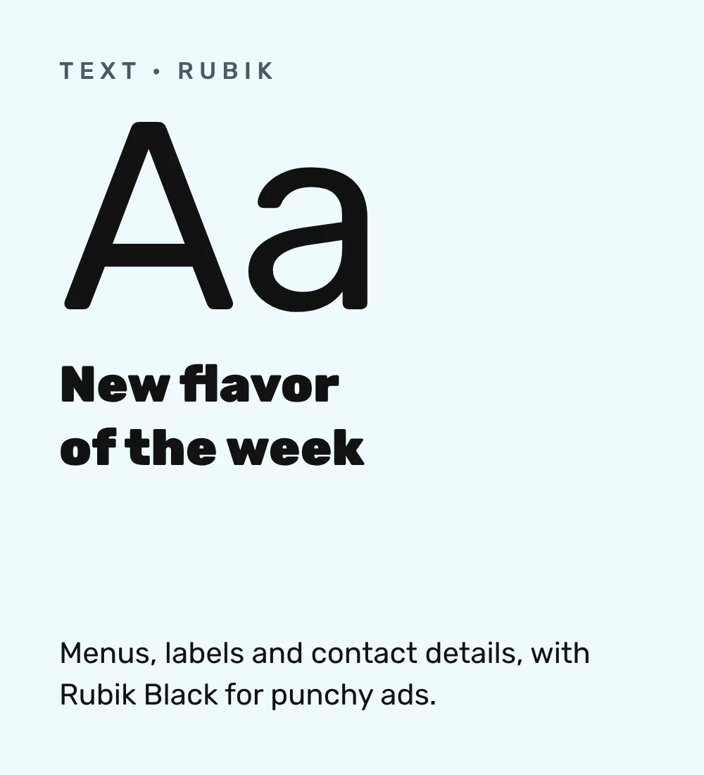
Two typefaces carry the brand. Fredoka has rounded letters that echo the wordmark, for headlines, names and prices. Rubik keeps menus, labels and contact details clear.
05Hydration Hut
The cans
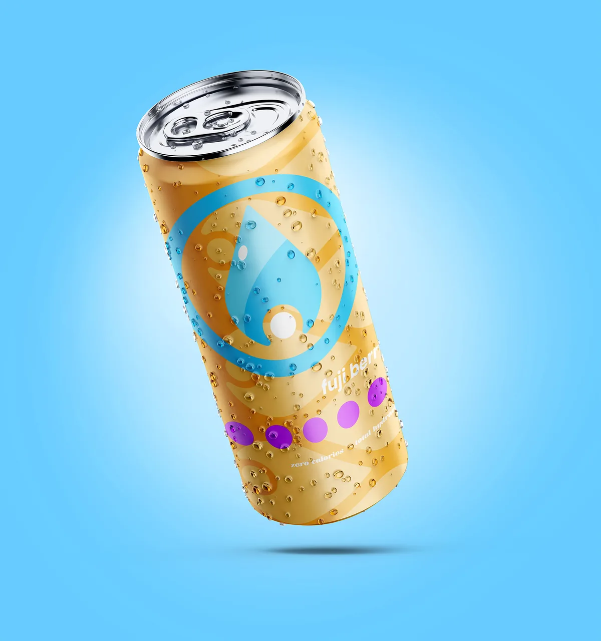
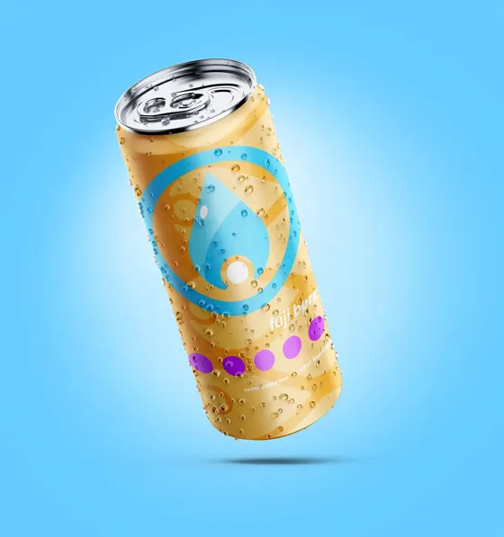
Every can carries the drop inside a ring, its own shade and a row of dots, with two lines on the side: zero calories, total hydration. The range includes tropical mango, blue razz and fuji berry.
06Hydration Hut
Brand elements
Three shapes come from water and the cans: the ring that holds the drop, a row of flavour dots and a strip of sky tape. Each piece uses one or two of them, never all three.
07Hydration Hut
Business cards
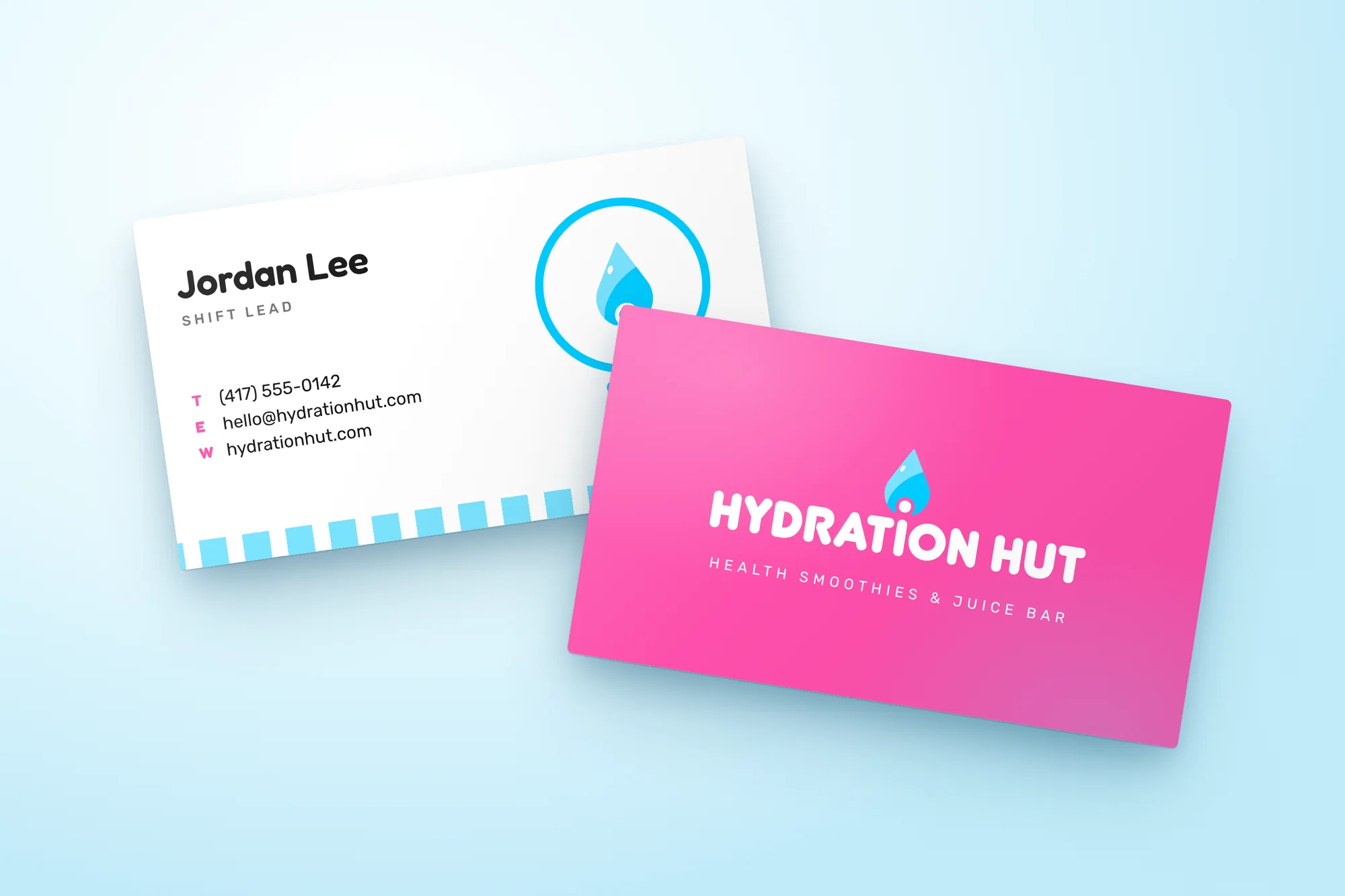
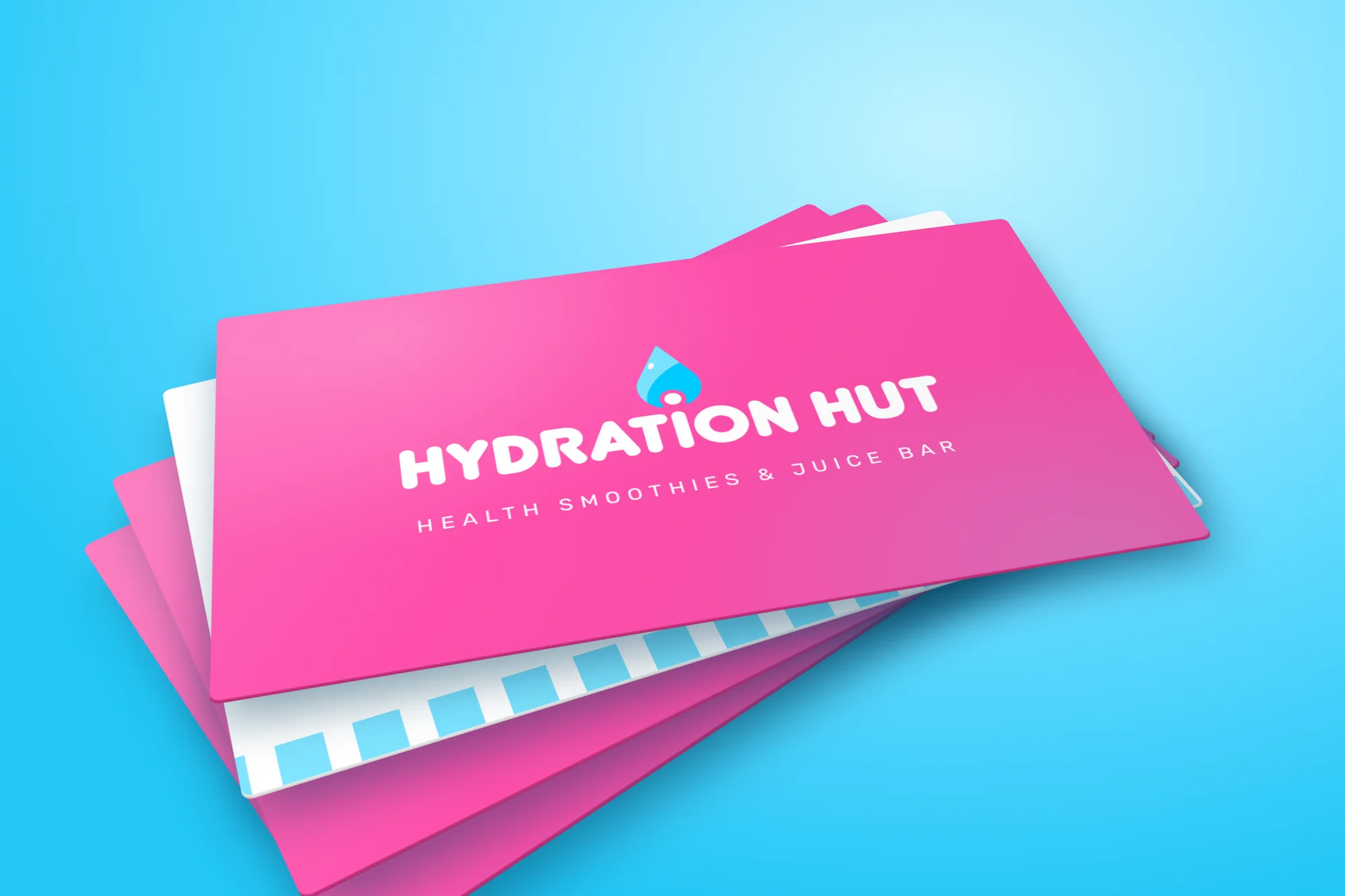
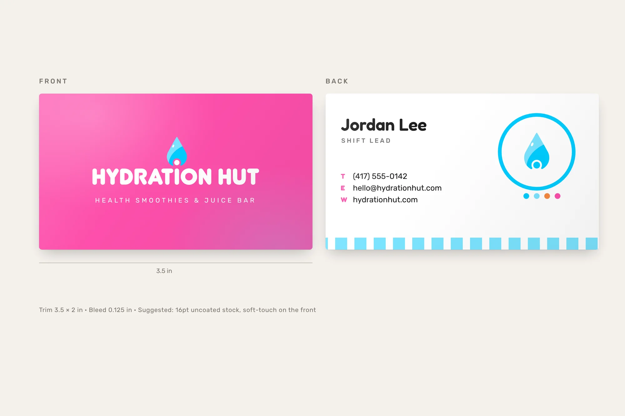
The front leads with pink and the logo. The back carries the contact details, the drop in its ring, the flavour dots and the sky tape along the edge. The name on the cards is sample text.
08Hydration Hut
In use
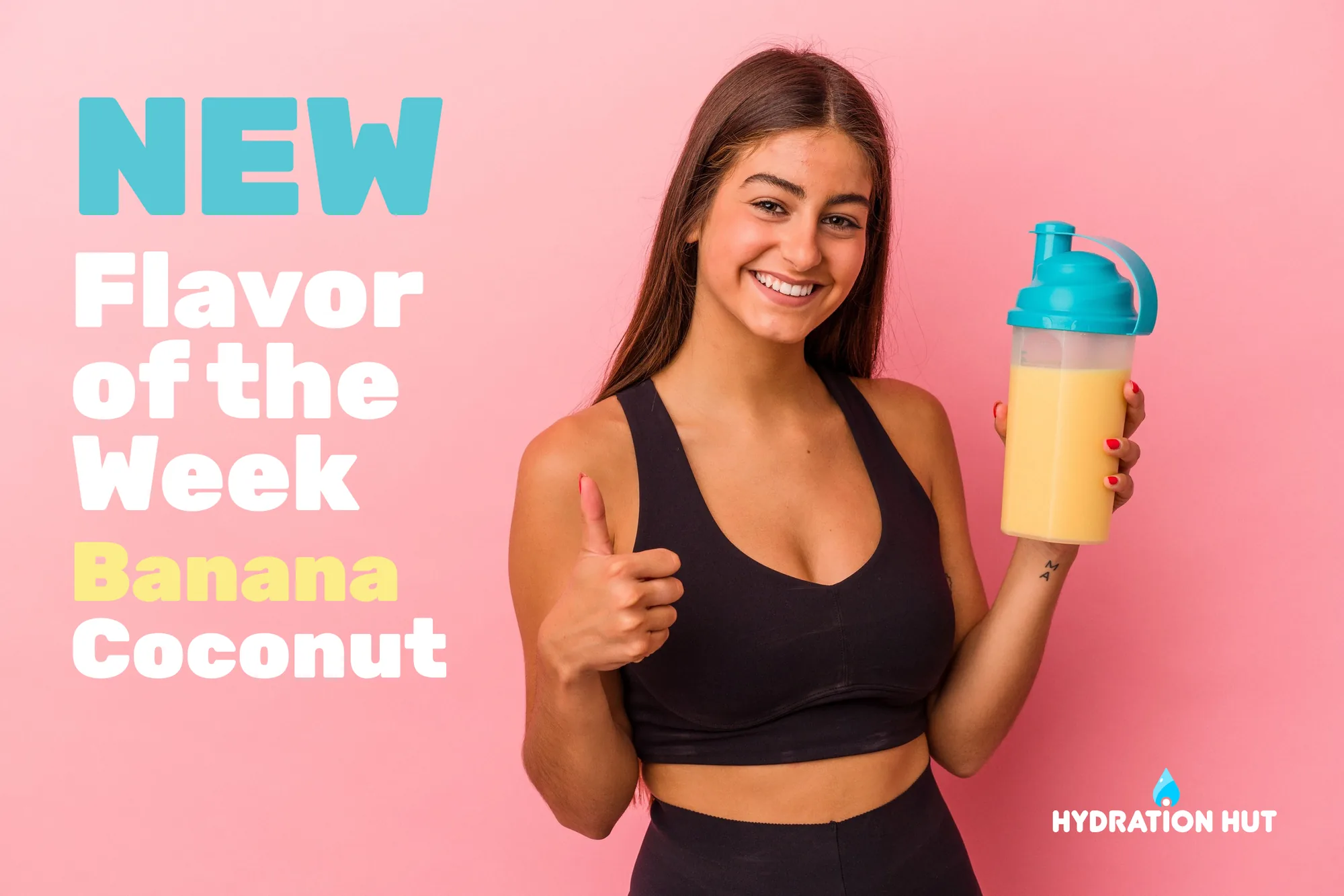
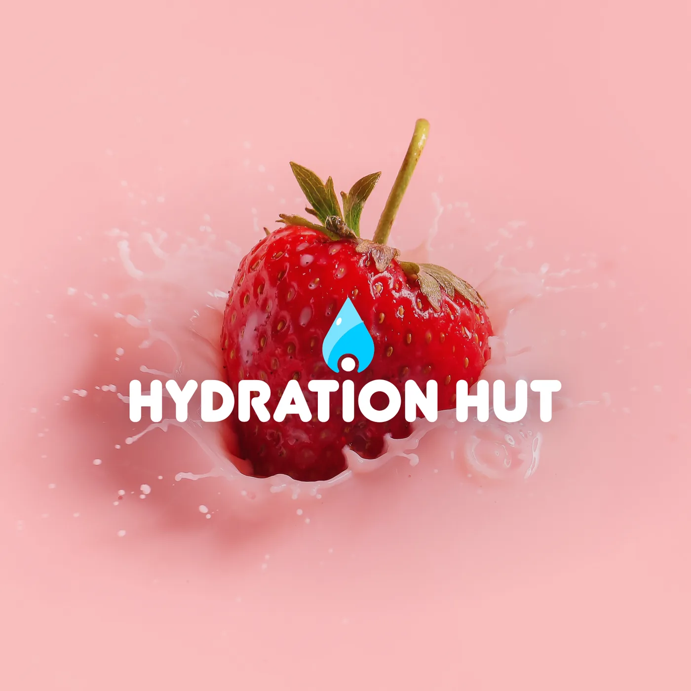
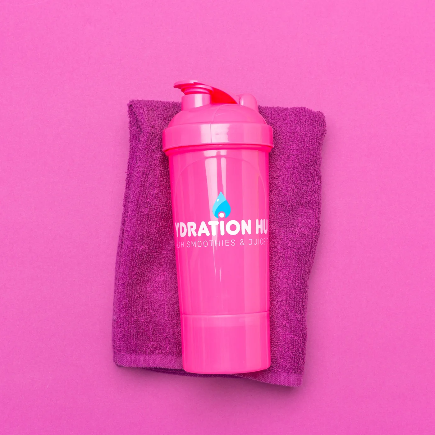
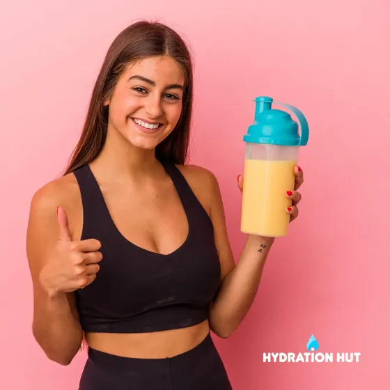
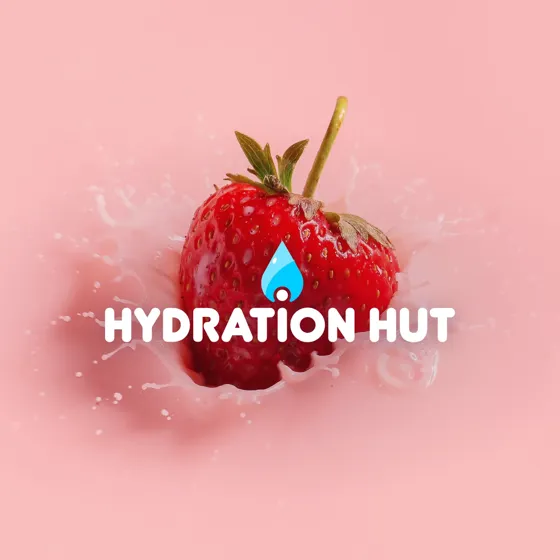
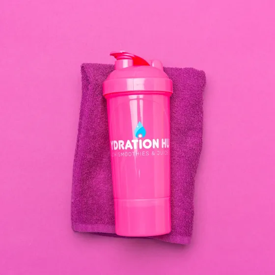
The brand at work: a flavor of the week ad, a strawberry splash and a branded shaker.